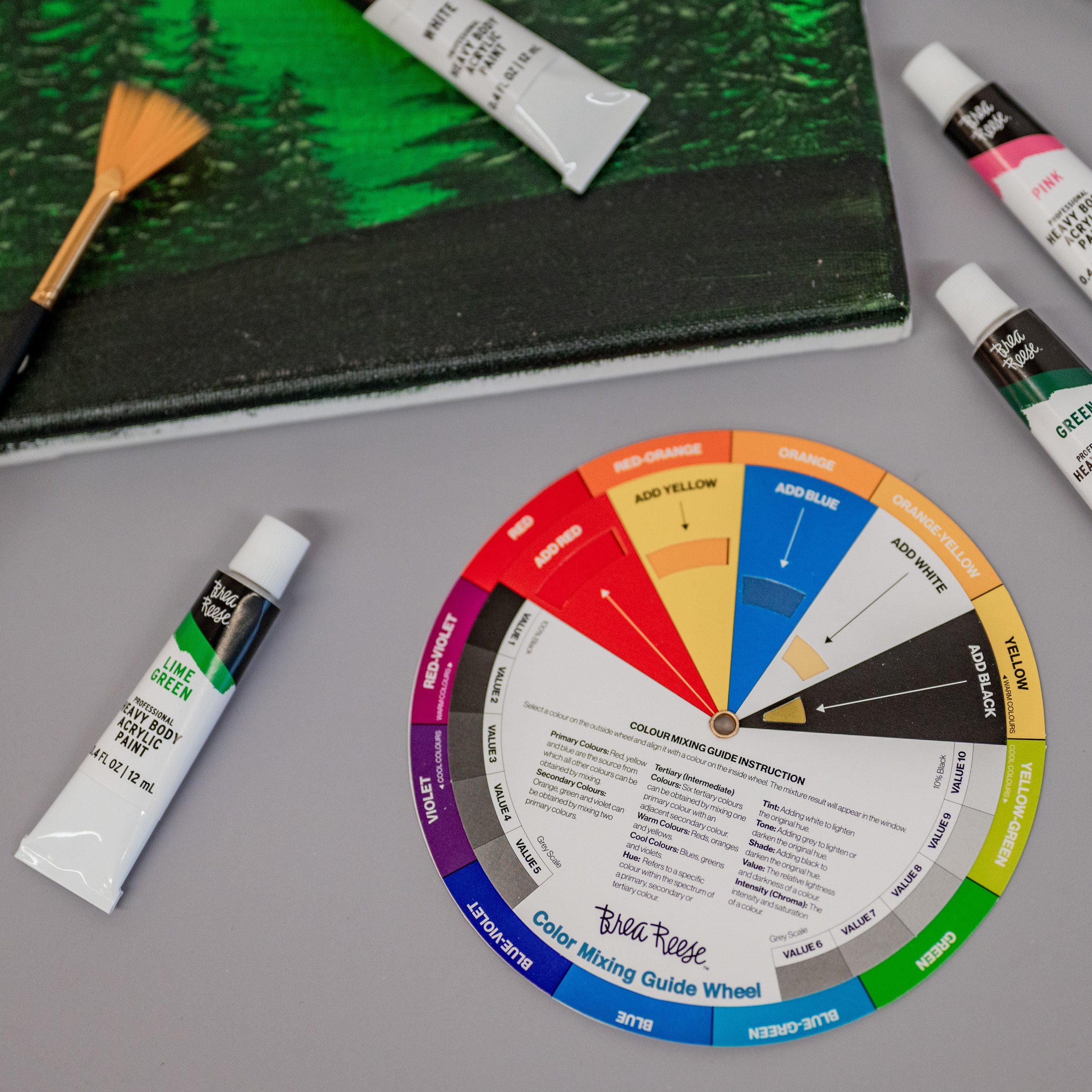
How to Use a Color Wheel: A Brea Reese® Guide to Color Harmony
At Brea Reese®, we know that mastering color can take your art to the next level. Whether you're a painter, crafter, or designer, understanding how to use a color wheel is key to creating stunning, harmonious pieces. This simple tool can transform how you approach color, making your choices more intentional and impactful. Let’s break down the basics of the color wheel and how you can use it to bring your creative vision to life.
What is a Color Wheel?
A color wheel is an essential tool that organizes colors in a circle to show their relationships. It’s divided into:
Primary Colors: Red, blue, and yellow—these are your foundational colors and cannot be made by mixing other colors.
Secondary Colors: Orange, green, and purple, created by mixing the primary colors.
Tertiary Colors: These result from mixing a primary color with a neighboring secondary color, like red-orange or blue-green.
Using the color wheel, you can explore combinations that make your artwork stand out and find the perfect balance between boldness and harmony.
Color Schemes: Finding Your Perfect Match
Complementary Colors
Opposites attract, right? Complementary colors are positioned directly across from each other on the wheel, like blue and orange. Pairing these hues creates eye-popping contrast, making each color stand out. It’s bold, dramatic, and a little like throwing a party for your eyes. Just remember—like all good things, use in moderation.Analogous Colors
For a more subtle, harmonious effect, choose colors that sit next to each other, like blue, blue-green, and green. This scheme is for those moments when you want your colors to quietly complement each other without any unnecessary drama. Think of it as a soft melody rather than a full-blown rock concert.Triadic Colors
Want to add some playful energy? A triadic color scheme uses three colors evenly spaced around the wheel—think red, yellow, and blue. It’s bright and dynamic without being chaotic, perfect for when you want every element to hold its own without stealing the spotlight.Monochromatic Colors
For a minimalist approach, stick with a monochromatic scheme. Pick one color and explore its variations—lighter tints (add white) and darker shades (add black). This is sophistication in its purest form, delivering subtle elegance without overcomplicating things.Split-Complementary Colors
If you love the idea of contrast but want something a bit more nuanced, split-complementary is your best bet. Instead of pairing two opposites, pick one base color and pair it with the two colors next to its opposite. It’s like the complementary scheme’s more refined cousin—just as effective but with a softer, more balanced feel.
Brea Reese® Tips for Using the Color Wheel
Choose a Dominant Color: Pick one color to lead your palette, then use the color wheel to select accents that complement or balance your work.
Play with Shades and Tints: Add dimension by incorporating lighter and darker versions of your chosen hues, giving your artwork depth and intrigue.
Warm vs. Cool Tones: Warm colors (reds, oranges, yellows) bring energy, while cool colors (blues, greens, purples) evoke calm. Use these tonal differences to set the mood of your piece.
Add Neutrals: If your artwork feels too intense, neutral tones like white, black, or gray can balance the boldness and bring everything together.
Consider the Mood: Colors evoke emotions. Red can create excitement, while blue offers serenity. Always keep the psychological impact of your color choices in mind when starting a new piece.
Tips for Mastering the Art of Color Mixing
Add White for Tints: Lighten things up with a touch of white, perfect for creating soft, pastel versions of any hue.
Add Black for Shades: Want a moodier, more dramatic tone? Black’s your friend for adding depth and darkness.
Add Yellow or Blue: Adjust the temperature of your colors by adding yellow to warm things up or blue to cool them down.
At Brea Reese®, we believe the color wheel is more than just a tool—it’s the foundation for expressing creativity. Whether you're experimenting with bold complementary colors or crafting harmonious analogous schemes, the color wheel opens up endless possibilities for your art. So next time you sit down with your paints, let the color wheel inspire you to make deliberate, beautiful choices that will elevate your artwork. Happy painting!


